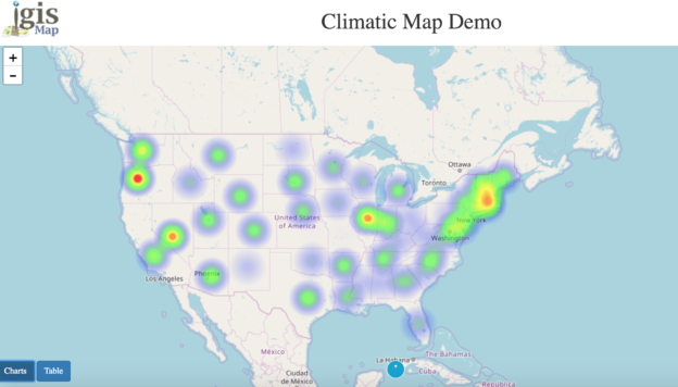
First of all we must know what heat map is? A Heat Map is a way of representing the density or intensity value of point data by assigning a colour gradient to a raster where the cell colour is based on clustering of points or an intensity value. In this article i.e to Create Heat map showing average household income. If you are not familiar with Leaflet then you may also look over Getting started with Leaflet js and all other leaflet js tutorial article page.
Create Heat map showing average household income – leaflet js GIS
Firstly we will initialise the container and add Open street map. As data is in JSON array format, to extract each value a for loop is applied. Here UsIncome is the data containing name, latitude, longitude and income value of each county of US.
for (var i = 0; i < UsIncome.length; i++) {
var a = UsIncome[i];
var name=a[0];
var income=a[3];
}
As average household income has used as intensity value. A function getMax() gets the maximum value of property from array.
var maximum;
function getMax(arr, prop) {
for (var i=0 ; i<UsIncome.length ; i++) {
if (!maximum || parseInt(UsIncome[i][prop]) > parseInt(maximum[prop]))
maximum = UsIncome[i];
}
return maximum;
}
Now to use heatLayer or create heat map you need to add plugin either by downloading from https://github.com/pa7/heatmap.js/releases or adding script in your document. The map() method creates a new array with the results of calling a function for every array element addressPoints is an array of latitude and longitude.
L.heatLayer(latlngs, options)
Constructs a heatmap layer given an array of points and an object with the following options:
minOpacity – the minimum opacity the heat will start at
maxZoom – zoom level where the points reach maximum intensity (as intensity scales with zoom), equals maxZoom of the map by default
max – maximum point intensity, 1.0 by default
radius – radius of each “point” of the heatmap, 25 by default
blur – amount of blur, 15 by default
gradient – color gradient config, e.g. {0.4: ‘blue’, 0.65: ‘lime’, 1: ‘red’}
addressPoints = UsIncome.map(function (p) { return [p[1], p[2]]; });
var a=L.heatLayer(addressPoints,{max: getMax(UsIncome,’Median Annual Household Income’), minOpacity: 0.05,
maxZoom: 18,
radius: 25,
blur: 15,
gradient: {
0.2: ‘green’,
0.60: ‘yellow’,
1.0: ‘red’},maxZoom:14}).addTo(map);
In the last markers are added with opacity 0.01 to make it invisible. BindTooltip has similar use as hover, shows popup when mouse is on marker.
var marker = L.circle(locations, { opacity: 0.01 }).bindTooltip(income+”,”+name , {className: ‘myCSSClass’}).addTo(map);
}
Here’s how the heat map created with leaflet js would look like :

You may also check the working example here:
http://www.igismap.com/portfolio/climate/ : climate US Heat Map
Heat map considered as best when it comes to visualization of information on map. Large amount of data can easily be visualized on map. It has various uses
- Pollution level in any country
- Crime rate
- Population in any area
- Hottest and coolest city
- Traffic information
- Different water level
I hope this may help you in developing and creating a heat map in leaflet js. If you find any problem in creating one such example do let us know by commenting below.
