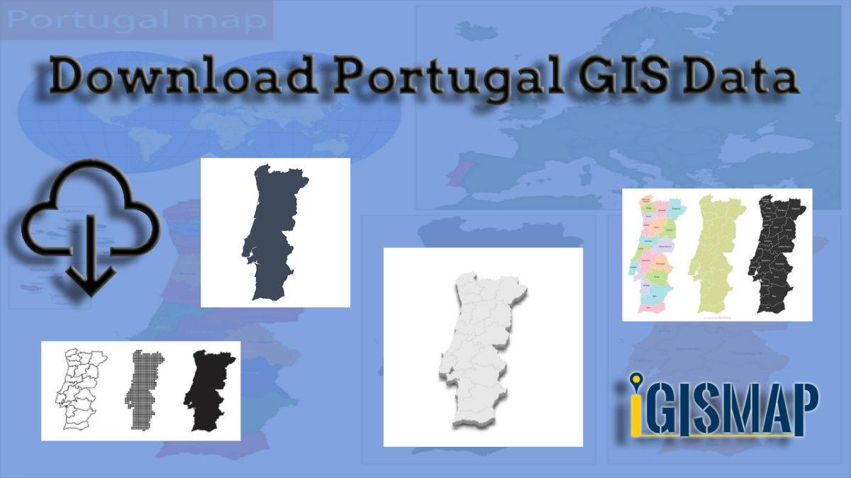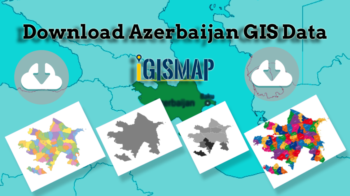
Are you tired of endless searching for accurate and reliable GIS data for your chosen country? Your search ends here, as IGISMAP comes to the rescue! We take pride in offering an all-inclusive GIS data collection covering 150+ countries. Within our platform, you’ll discover an extensive array of over 150 GIS datasets available for each nation. What sets our GIS data apart is its unparalleled accuracy, especially when it comes to representing administrative divisions. Furthermore, we provide a diverse range of data relating to natural and man-made geographic features, such as rivers, roads, railway lines, airport locations, and more. Anyone can access GIS data from IGISMAP through two important tools: Download GIS Data and Add GIS Data. For a deeper understanding of the Add GIS Data tool’s functionalities, refer to our informative article – Add GIS data from IGISMap GIS data collection.
In this comprehensive article, we’ll walk you through the essential administrative level GIS data available for Azerbaijan in Download GIS Data tool. Choose from a variety of formats, including ESRI Shapefile, KML, GeoJSON, or CSV, tailored to suit your needs. Leave the hassle of GIS data searching behind, and embark on a seamless geospatial journey with IGISMAP by your side!
Note:
- All data available are in GCS datum EPSG:4326 WGS84 CRS (Coordinate Reference System).
- You need to login for downloading the shapefile.
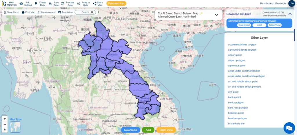
Download Shapefile Data of Azerbaijan
Azerbaijan, officially known as the Republic of Azerbaijan, is a unique transcontinental country situated at the crossroads of Eastern Europe and Western Asia. It forms part of the South Caucasus region and shares borders with various countries. To the east lies the beautiful Caspian Sea, while Russia (Republic of Dagestan) is situated to the north. Azerbaijan is bordered by Georgia to the northwest, Armenia and Turkey to the west, and Iran to the south. The bustling city of Baku serves as the capital and largest city of the country.
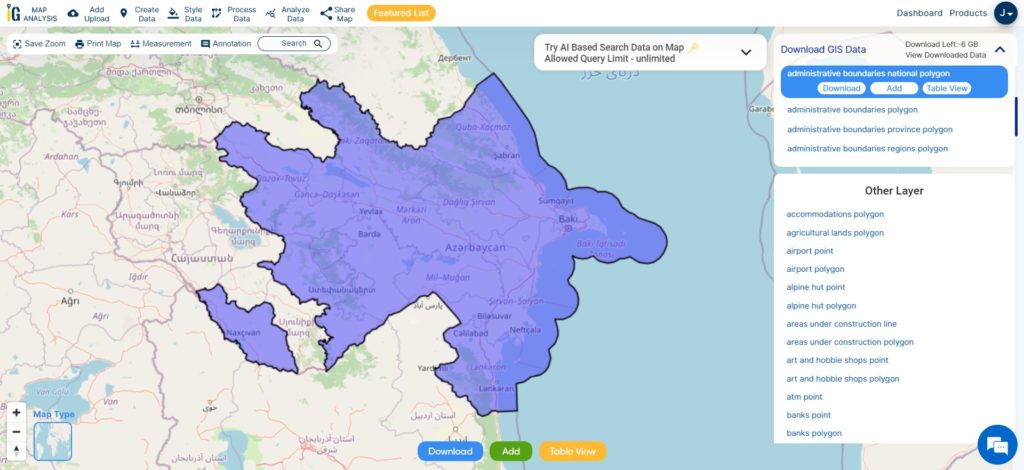
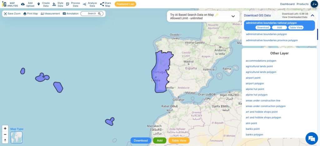
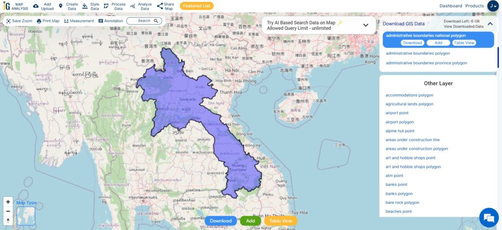
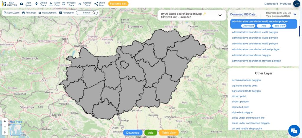
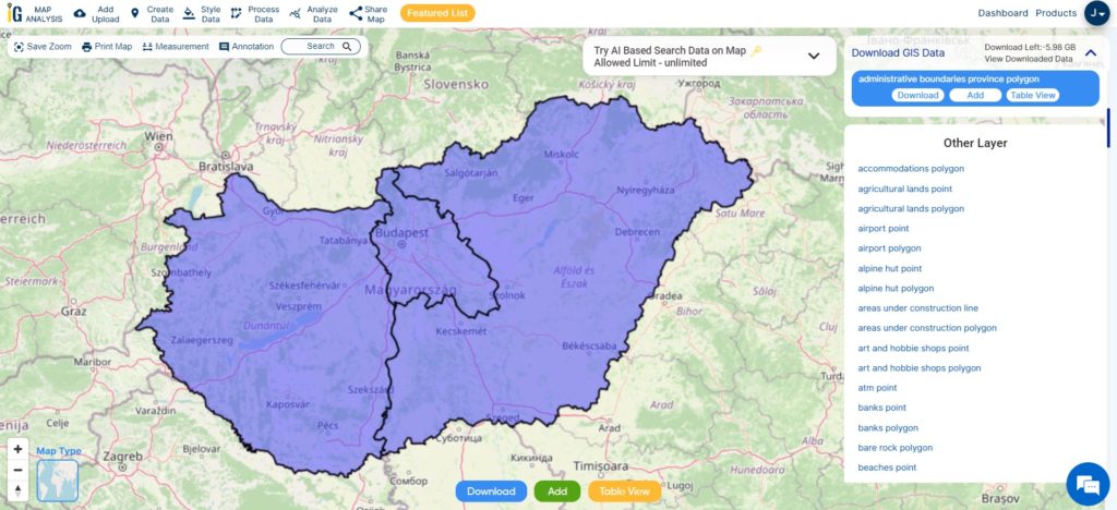
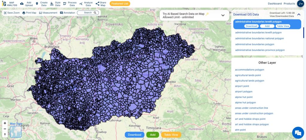
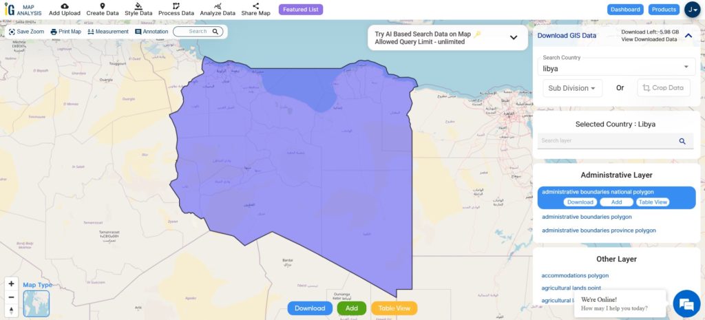
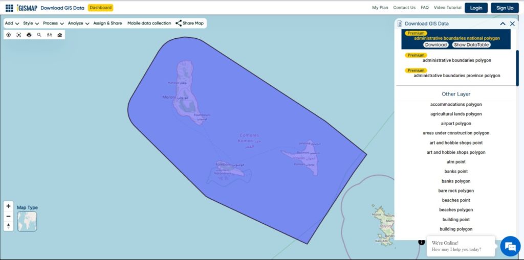
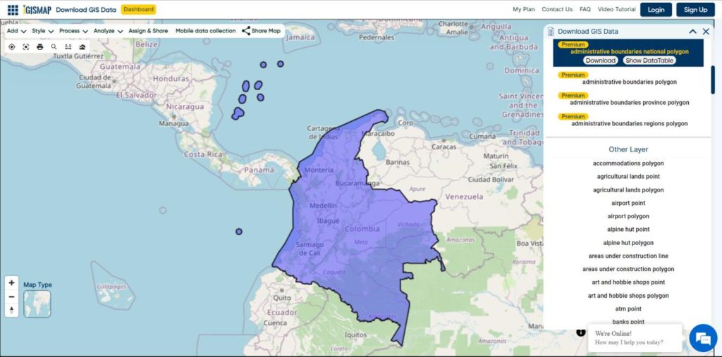
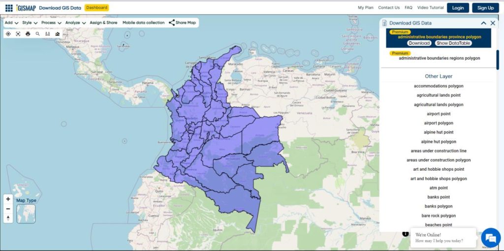
Download National Boundary Shapefile
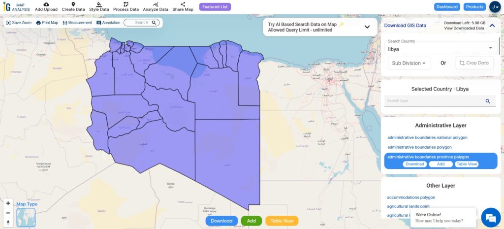
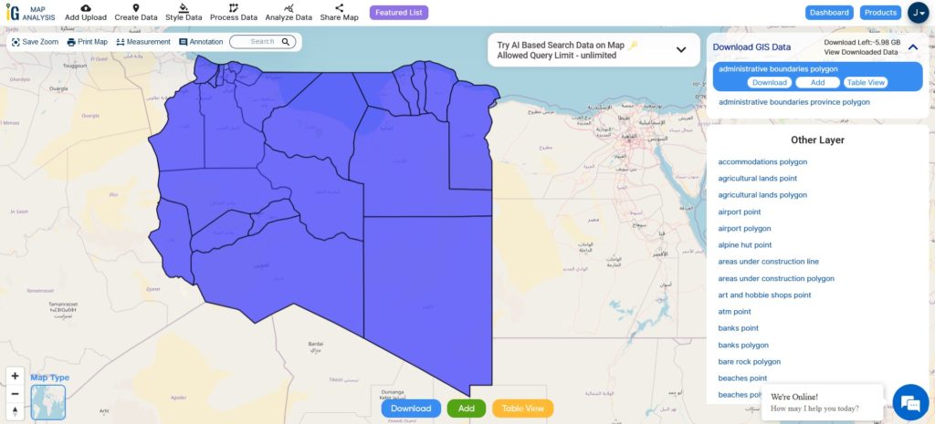
After successfully logging in with a legitimate email address, select the country you want to work with. Next, choose the specific layer you need and click on the download option. Once that’s done, pick the desired format to acquire the essential GIS data. Before proceeding with the data download, make sure to review the data table for any relevant information.
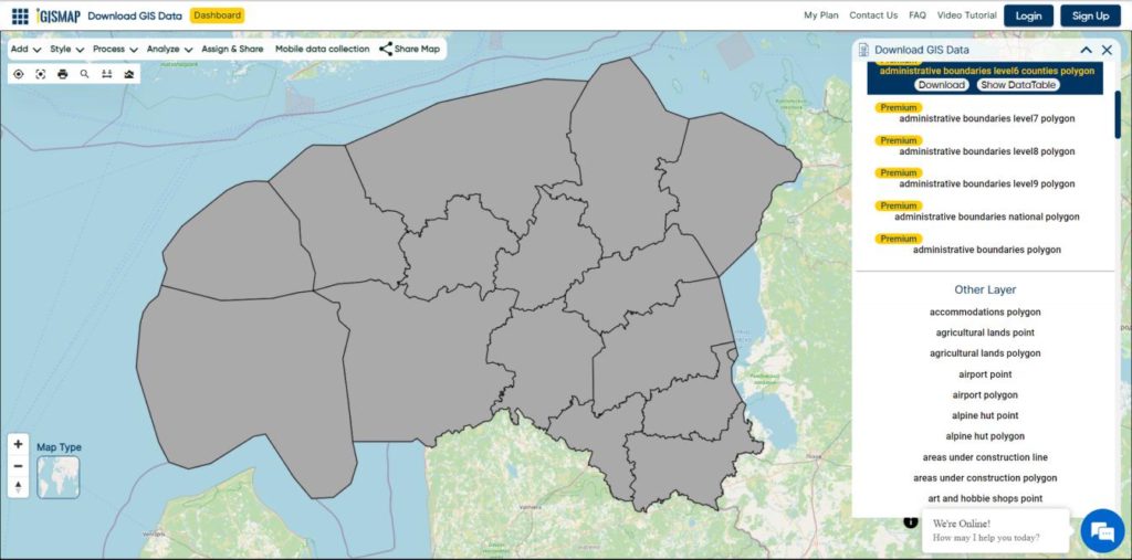
Download Azerbaijan Economic regions and Subregion Shapefile Data
The economic regions of Azerbaijan consist of 14 distinct regions within the country. These regions are characterized by their unique economic and geographical positions, as well as their territorial and economic unity. They display a wide range of natural and economic conditions, each with its own specialized industries.
Before 2021, Azerbaijan was divided into 10 economic districts. However, a significant change occurred on July 7, 2021, when President Ilham Aliyev issued a decree that redefined the division of economic regions in Azerbaijan. This decree resulted in the abolition of some former regions and the establishment of new ones. As a result, the country now comprises a total of 14 economic districts.
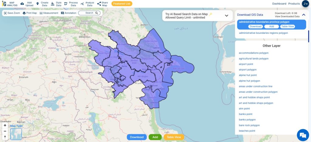
Download Azerbaijan Eco-Regions Shapefile
This shapefile covers following Economic regions of Azerbaijan listed below:
- Absheron
- Ganja-Gazakh
- Guba-Khachmaz
- Shaki-Zaqatala
- Lankaran
- Shirvan
- Upper Karabakh
- Kalbajar-Lachin
- Mountainous Shirvan
- Nakhchivan
- Upper Garabagh
- Aran
- Central Aran
- Goychay-Zagatala
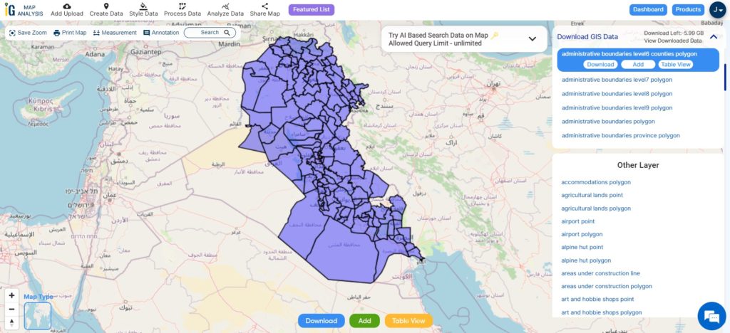
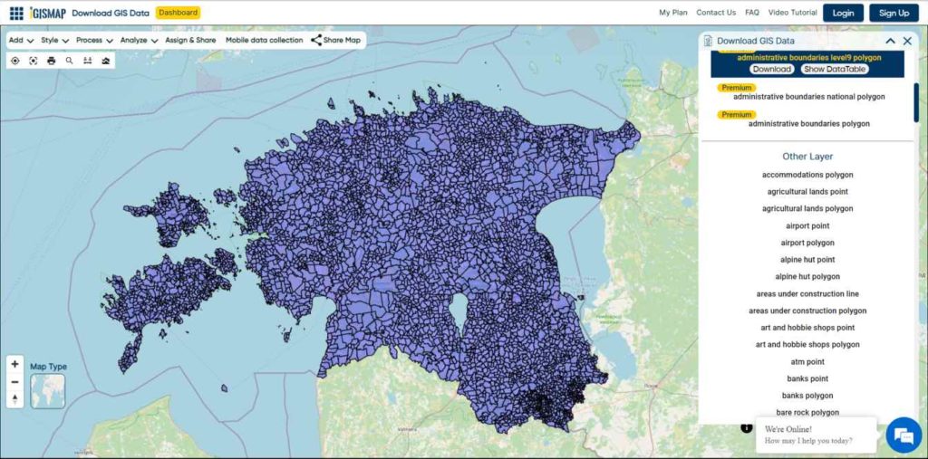
Download Azerbaijan Districts Shapefile Data
Azerbaijan, with its diverse territory, is organized into eight regions, one of which is the autonomous region of Naxcivan. Within these regions, there are a total of 59 districts, with eight districts falling under the jurisdiction of Naxcivan (Figure 4). The capital city of Baku, with a population of 2,725,000, is further divided into 10 districts and 48 municipalities. Notably, Baku is twinned with the city of Naples in Italy.
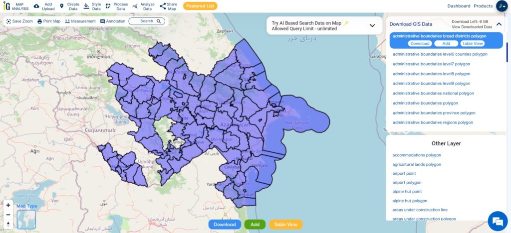
Download Azerbaijan Districts Shapefile
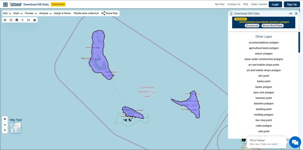
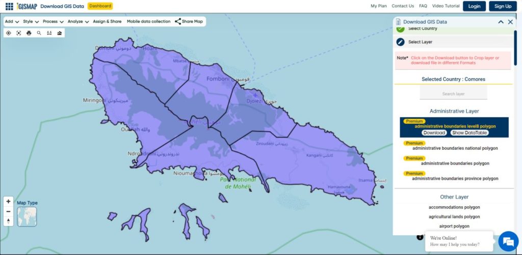
Other Administrative Boundary Data:
- Download Administrative Boundaries regions polygon Shapefile
- Download Administrative Boundaries Level7 Polygon Shapefile
Other GIS Data:
- Download Azerbaijan Airport Point Shapefile
- Download Azerbaijan Railway Lines Shapefile
- Download Azerbaijan Road Lines Shapefile
- Download Azerbaijan Rivers Shapefile
Above all links are provided for GIS data of Azerbaijan if you are looking for any specific data please write us on support@igismap.com
Download Shapefile for the following:
- World Countries Shapefile
- Australia
- Argentina
- Austria
- Belgium
- Brazil
- Canada
- Denmark
- Fiji
- Finland
- Germany
- Greece
- India
- Indonesia
- Ireland
- Italy
- Japan
- Kenya
- Lebanon
- Madagascar
- Malaysia
- Mexico
- Mongolia
- Netherlands
- New Zealand
- Nigeria
- Papua New Guinea
- Philippines
- Poland
- Russia
- Singapore
- South Africa
- South Korea
- Spain
- Switzerland
- Tunisia
- United Kingdom Shapefile
- United States of America
- Vietnam
- Croatia
- Chile
- Norway
- Maldives
- Bhutan
- Colombia
- Libya
- Comoros
- Hungary
- Libya
- Laos
- Estonia
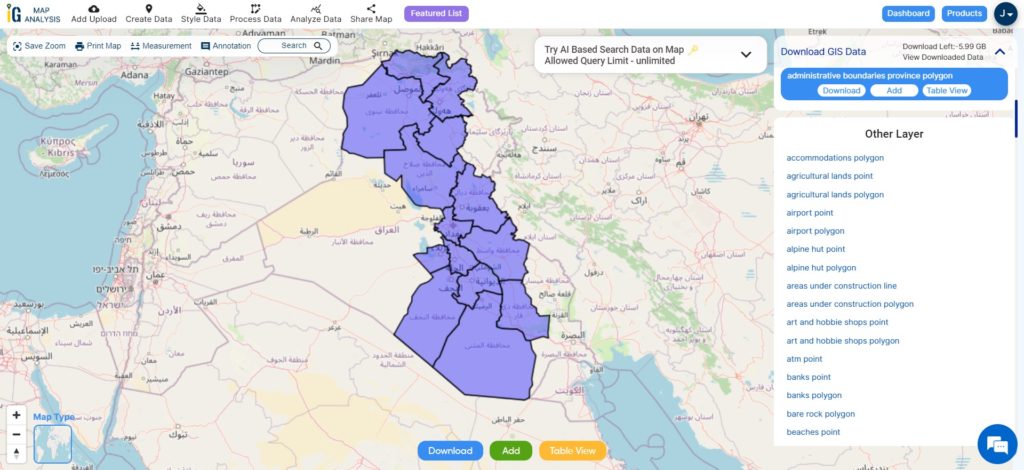
- Iraq
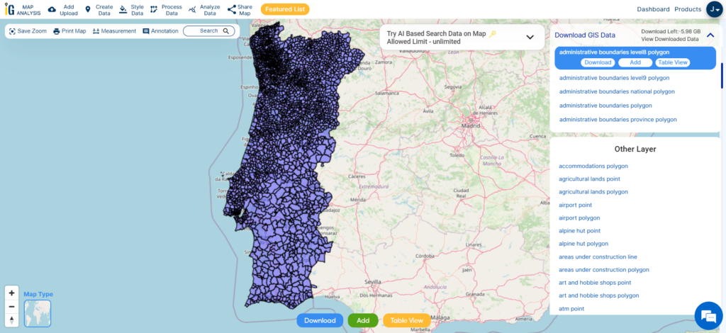
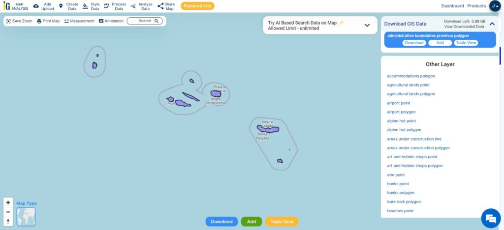
- Portugal
- Azerbaijan
- Macedonia
- Romania
- Peru
- Marshall Islands
- Slovenia
- Nauru
- Guatemala
- El Salvador
- Afghanistan
- Cyprus
- Syria
Disclaimer : If you find any shapefile data of country provided is incorrect do contact us or comment below, so that we will correct the same in our system as well we will try to correct the same in openstreetmap.